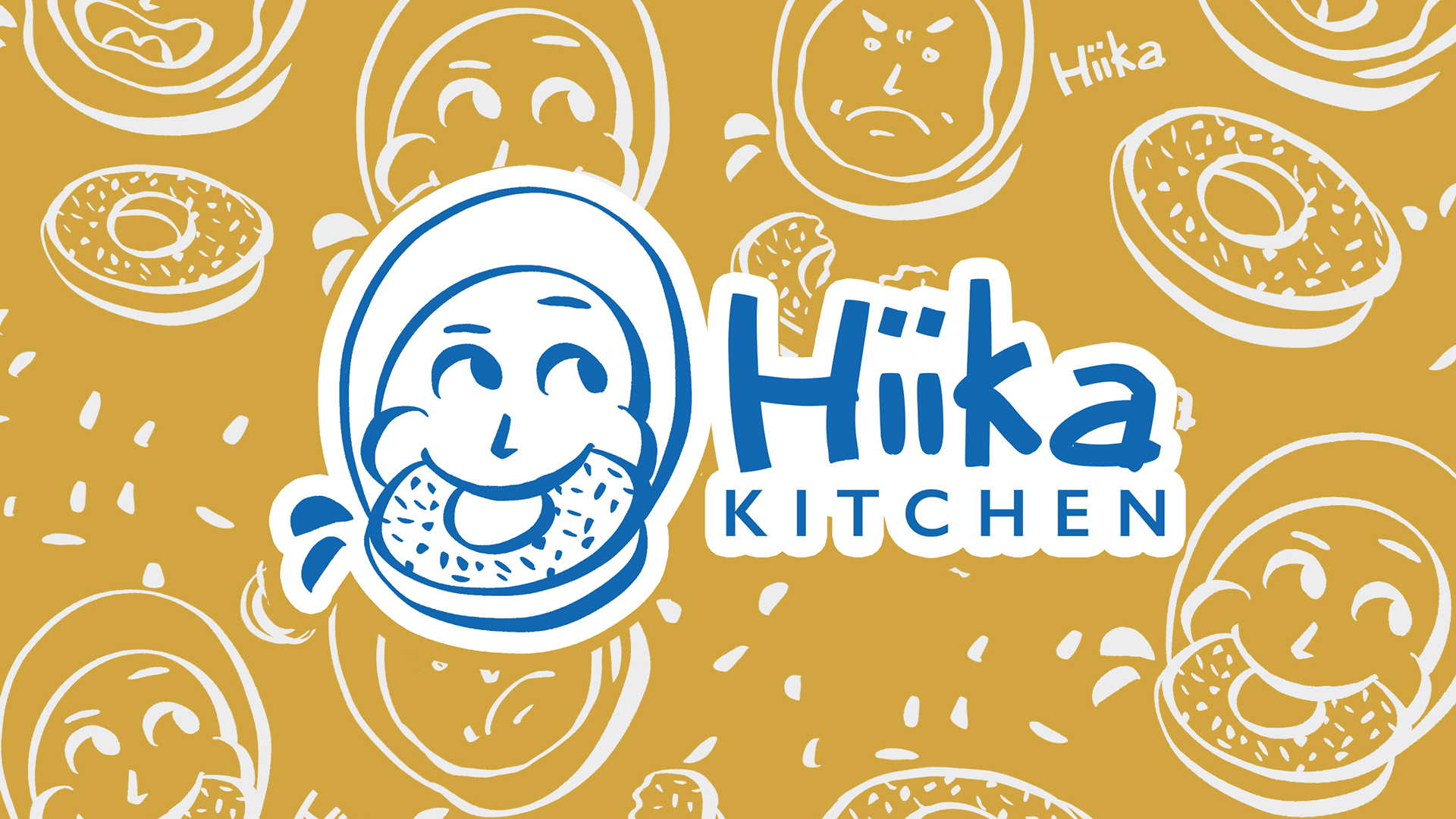
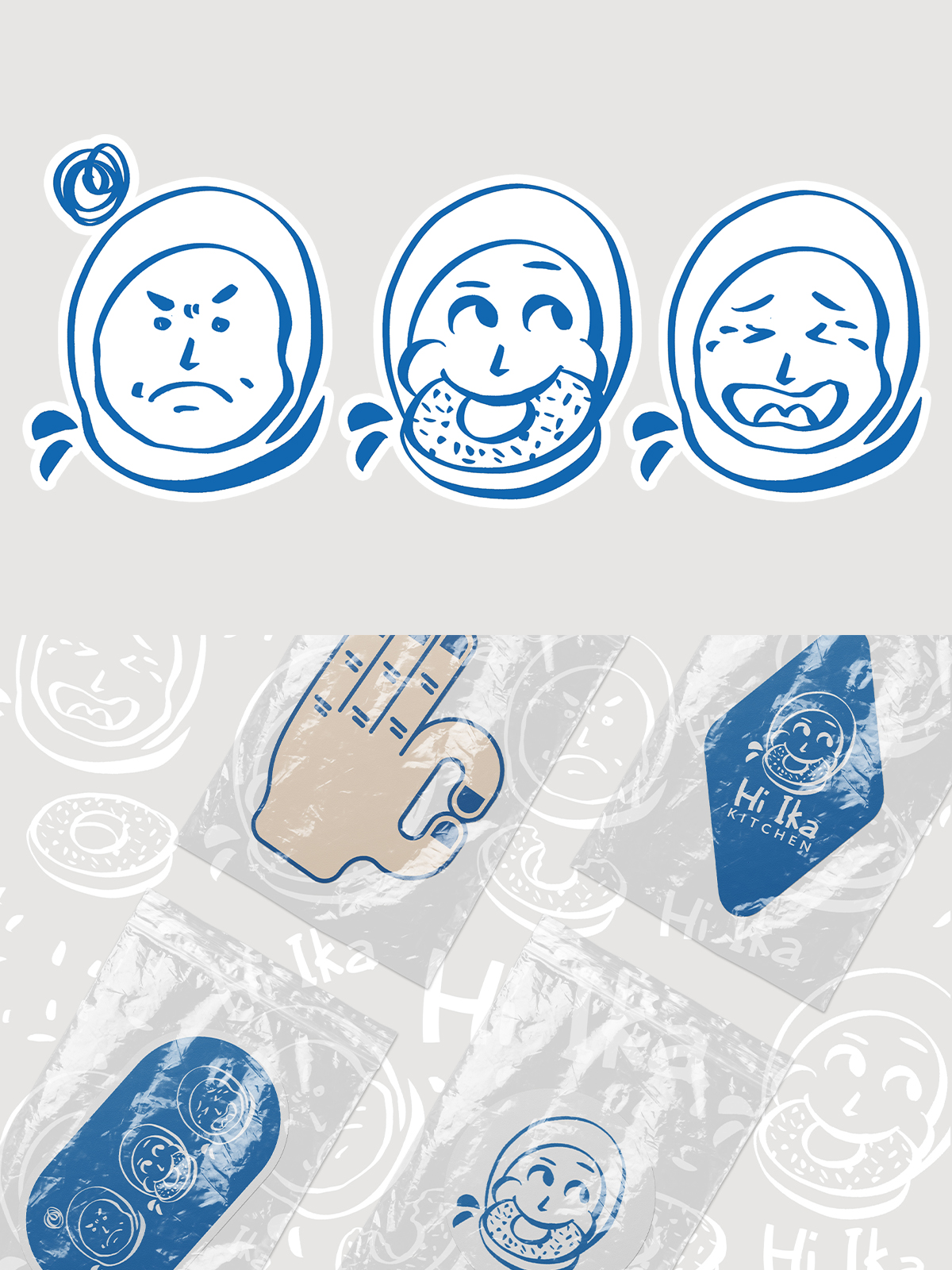
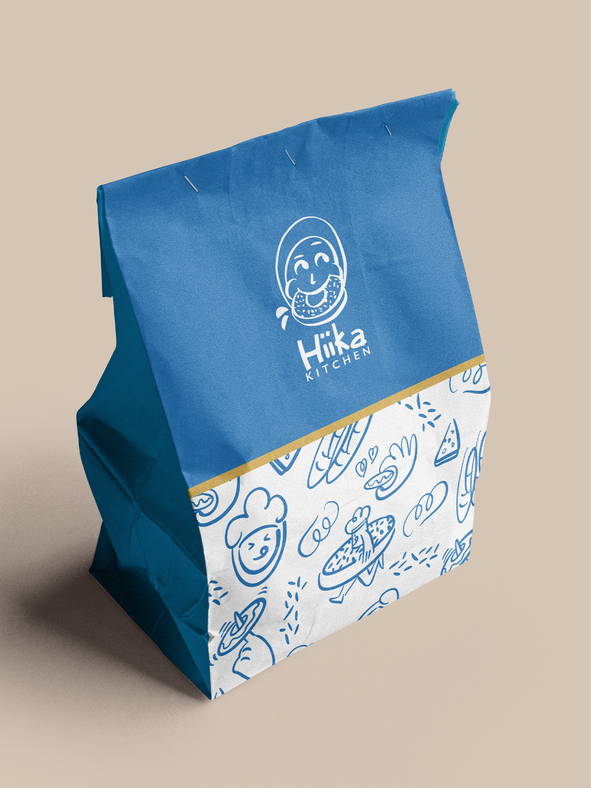
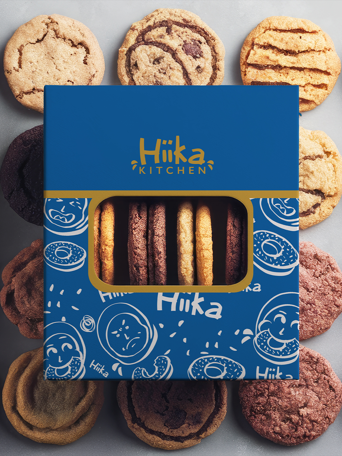
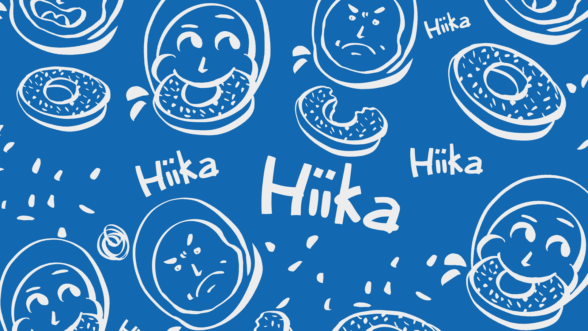
Hiika Kitchen is a rebranding project developed to refresh the brand identity into something more fun, playful, and full of character. The new visual direction responds to the brand’s market, which is closely associated with gifts, souvenirs, and celebratory moments. Through a more expressive logo, cheerful illustration style, and a bright color composition, the identity is designed to feel warm, memorable, and approachable. The character-based visual language helps the brand communicate a sense of joy and friendliness, while remaining flexible across packaging and supporting applications. More than a visual update, the rebranding gives Hiika Kitchen a clearer personality—one that reflects the spirit of sharing, giving, and celebrating.